Why is the Metropolitan’s online Gift Store not generating more revenue?
a conceptual project, March 2017
Content
The Problem
With large retailers like Amazon, and craft-oriented online buyer and seller communities like Etsy, even niche retailers like online museum stores have to design their websites in the most user-friendly way possible in order to remain competitive. In particular, this means designing intuitive and efficient filtering processes.
My objective in this conceptual project was to redesign the navigation and filtering mechanisms at the Met’s online gift store to increase revenue from their online sales.
Contextual Inquiry
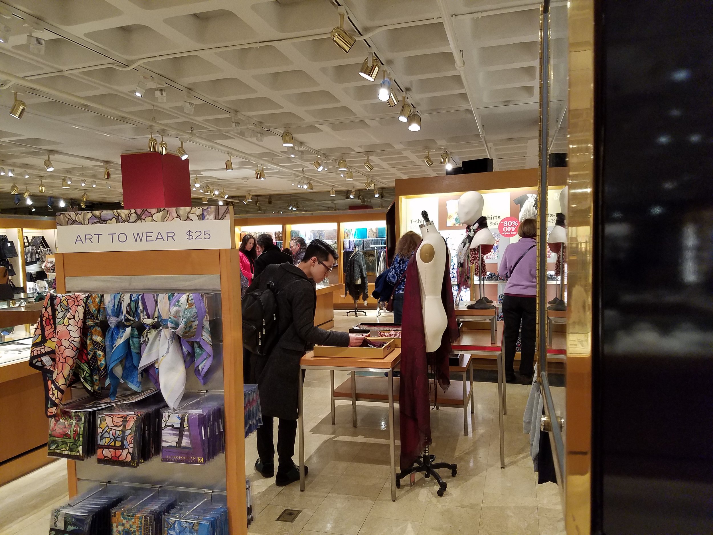
My partner Matthew Gottesman and I went to the Met’s physical gift store at the Met to observe shoppers and talk to them. Our goal was to find out how people behave in a physical museum store and contrast the behavior to online shopping habits.
Below are some of the questions we set out to answer:
How much time do they spend in the store?
Which search and filter strategies do they use?
Do they buy? And if so, what?
How much money do they spend?
Which products are the most popular ones?
How does the layout of the store influence their behavior?
How does the layout of the store influence what is bought?
What kind of different shopping strategies can we observe?
How focused are shoppers in a physical store?
How many shoppers turn to sales people to ask questions?
We found that people were generally completely absorbed by their shopping experience and spent a lot of time in the store browsing, looking, handling objects and picking items to purchase. We observed 7 people from entry to exit. The average time spent in the store was 35 minutes. Everyone single shopper ended up buying at least one item, some people bought more than 3 items.
The layout of the store definitely guided people in their product discovery journey. One main sector of the store is tucked away toward the side and easy to overlook. Four of the people we observed discovered this part of the store after much time had passed but ended up buying products from that part of the store.
Above is the main section of the Met's NYC gift store. This is the book section and it's the section that users entered and searched first although they ended up buying from a tucked away side section that was at first overlooked by many.
Above is the tucked away section that users had a hard time finding. It is a very large section nonetheless and also by far the more popular one. All our observed users except one ended up buying from this section of the store.
Usability testing
In addition, I conducted several usability tests on the Met’s online gift store. Here are the main findings:
Users generally liked the visual layout of the site.
Users realized quickly how many attractive and unusual items the gift store offers.
However, users tended to be overwhelmed by the number of subcategories
Users were confused by indistinct product categories.
Many users had a hard time understanding the filtering mechanism of the online site that allows search results to be refined by applying one or several filters.
On average, users spent only 11 minutes on the online site in contrast to the 35 minutes spent in the physical store.
Personas
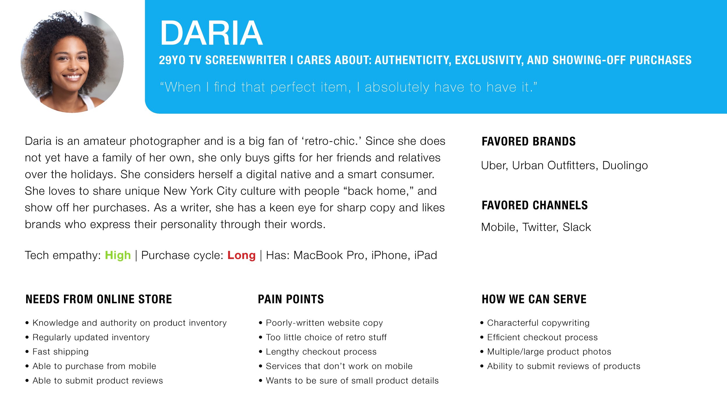
Our contextual inquiry and the usability tests provided us with a plethora of data points which we used to create three distinct personas: Trung, Daria and Roland.
Below are two of the personas: Roland and Daria. The personas provide demographic information as well as information about their behaviors, needs and pain points.
Above is our main persona Roland: "I know what I'm looking for - the hard part is finding it."
Daria: "When I find that perfect item, I absolutely have to have it."
Competitive and comparative analysis
In order to gain better understanding of how the Met’s online gift store fits into the museum gift store landscape and how well it is positioned in comparison to direct and indirect competitors, we conducted a competitive and comparative analysis.
Below is a competitive analysis with feature comparisons across six museums:
The Met
National Gallery Washington DC
The Louvre
Prado
The British Museum
Gemäldegalerie Berlin
Below is a comparative analysis with feature comparisons across four sites where people often shop to buy gifts: the Met’s gift store, Etsy, gifts. com and Barnes & Noble.
Heuristic analysis
We also conducted a heuristic analysis for the Met’s online gift store to pinpoint its strengths and weaknesses.
The result shows that there are problems with the navigation of the site as well as serious problems with filtering search results.
Card sorting
After realizing the confusion over product categories and subcategories, we decided to conduct three open and three closed card sorts in order to find out how users would structure the Met’s vast online giftstore content.
We selected 100 items from many different categories and created cards with the picture of the item and a description of the item. In the open sorts, testers had to group the items as they thought best, i.d. they had to define their own categories (and possibly sub-categories).
In the closed card sort, users had to assign each card to the given categories.
Here are some pictures from the open card sort:
Relevant Findings of Open Card Sorting
Testers created fewer main categories compared to the Met's online website
66% of testers created no sub-categories
33% of testers created sub-categories
All testers were confused about sculpture and model items
All testers created a miscellaneous pile for items they could not place into the main categories
Below are the new categories and sub-categories based on users' open and closed card sorting:
product impact from user research
Results from the open and closed card sorts showed us the way to a more intuitive way to organize the Met’s vast number of items.
Below is the current site map with a large number of categories and sub-categories. Note that one category - sculpture - has no sub-categories at all:
Based on our card sorting results, we re-designed the categories and sub-categories:
Sculpture as category was eliminated
Number of categories was reduced from 10 to 9
Number of sub-categories was reduced from a maximum of 12 to 9
Categories and sub-categories were changed
Order of categories in the primary navigation bar was changed according to what people buy most
Below is the re-designed sitemap:


