redesigning the Metropolitan Museum of Art’s online gift store
a conceptual project, March 2017
Content
Design goal
Based on our UX findings, we decided to re-design the online gift store with the goal of making the search and filtering capabilities intuitive and efficient.
Redesign of filtering mechanism
The current filtering mechanism:
Our usability tests had revealed the confusion over the filtering mechanism that allows people to narrow search results. At this crucial point in the purchase journey, users were abandoning the site because the filtering was too complex and didn’t allow them to quickly find the products they were looking for.
The Met’s filtering mechanism is not well designed because:
It presents the user with a plethora of filters but it is not clear how the filters are applied.
There is no intuitive visual feedback to let users know which filters are applied.
During user testing, users would choose one filter and then a second filter without understanding that the second filter was added to the first filter.
Users often did not see the list of applied filters at the very top of the long filter column.
Below is a screenshot of the current filtering mechanism at the Met’s online gift store:
Current Filtering
On the left hand side is a long filter column titled "Narrow By:".
It is not obvious how to choose one or several of the listed categories in order to narrow search results.
Some categories have so many sub-categories that users have to click on "More" and then start scrolling in the resulting dropdown list to see all of them.
There are no checkboxes to select listed categories.
Redesigned filtering mechanism:
The new filter mechanism is clear and intuitive.
Users are presented with a vertical row of filter switches that can be switched on or off.
When on, the switch turns to a bright green color so that users can see immediately which filters are applied.
When off, the filter is white and inconspicuous.
During testing, users immediately understood that turning on several filter switches meant applying several filters.
Below is a medium fidelity wireframe of the re-designed filter mechanism:
New Filtering
The new filter mechanism is intuitive: users toggle filters on or off. Visual feedback is immediate and unambiguous.
In this example, the user is filtering all kids' items by clearance and age group 9 to11.
Below is a high-fidelity mockup of the website with the new filtering mechanism in place:
New Filtering
The new filter mechanism is intuitive: users toggle filters on or off. Visual feedback is immediate and unambiguous.
Detailed wireframes
Below are medium fidelity wireframes that I built for a prototype to test the new menu with categories and sub-categories as well as the re-designed filtering mechanism:
Annotated wireframes
Below are three annotated wireframes. Annotated wireframes are very useful for the client since they not only show the result of the design but explain in detail why design decision were made and how.
All Kids' products Wireframe
All Kids Clearance Wireframe
All Kids Clearance and 9-11 yr bracket Wireframe
Usability Testing
The prototype was tested by a first round of five testers. Users were given the following tasks:
Go to the kids' section of the website
Filter kids' products by clearance and age group
Choose a toy from the clearance section for a nine year old boy
Add the toy to the shopping bag
Purchase the toy
Users had no problems carrying out these tasks. They did find some minor bugs but the overall flow proved easy and intuitive. The filtering of the kids' items page was a breeze for all of them.
In a second round of testing after some bug fixing and small visual improvements, the results were equally successful.
User 1 tests the wireframe prototype with revised sitemap and filtering
User 2 tests wireframe prototype with revised sitemap and filtering
Design Recommendations
A visual re-design of the site was outside of scope for this project.
The design could be improved by reducing the many differently aligned elements to several core sections and aligning them more consistently to a grid.
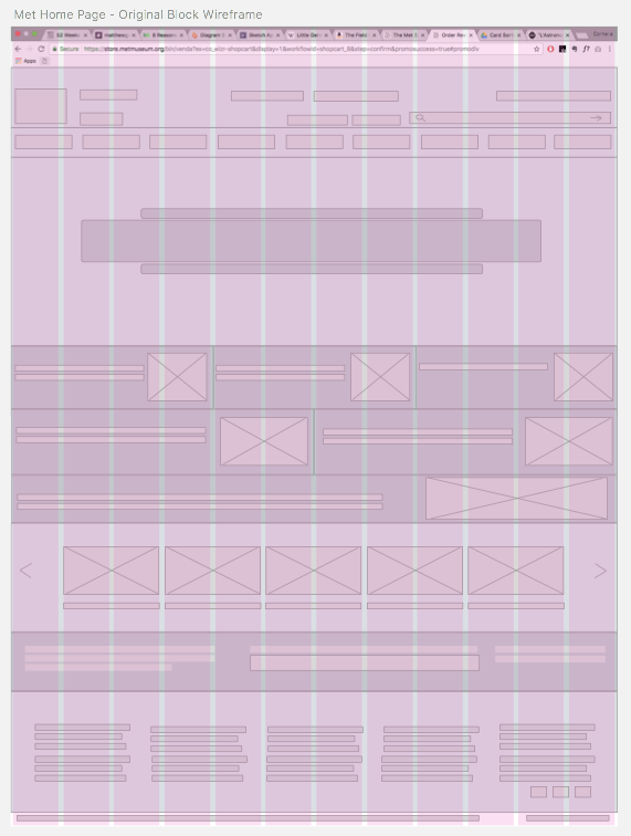
Below on the left is a block diagram of the existing site with column layout. With the layout visible, it's easy to see how badly aligned many elements are.
Below on the right is a revised block diagram with improved layout alignment.
Wireframe with layout columns for the current Home page of the Met's online giftstore
Revised design for a more consistently aligned wireframe


